The designer behind the iconic ‘everyman’ PBS logo sees the irony in its demise
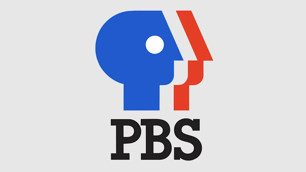
You’ve seen the PBS logo in the news a lot lately. The current logo—three facial silhouettes in white and blue—has remained largely unchanged since Tom Geismar, the cofounder of the canonical corporate design firm Chermayeff & Geismar, designed it in 1984. And its message has remained steadfast, too: PBS’s programming is a civic service for everyone, as an extension of the right to a public education in the United States.
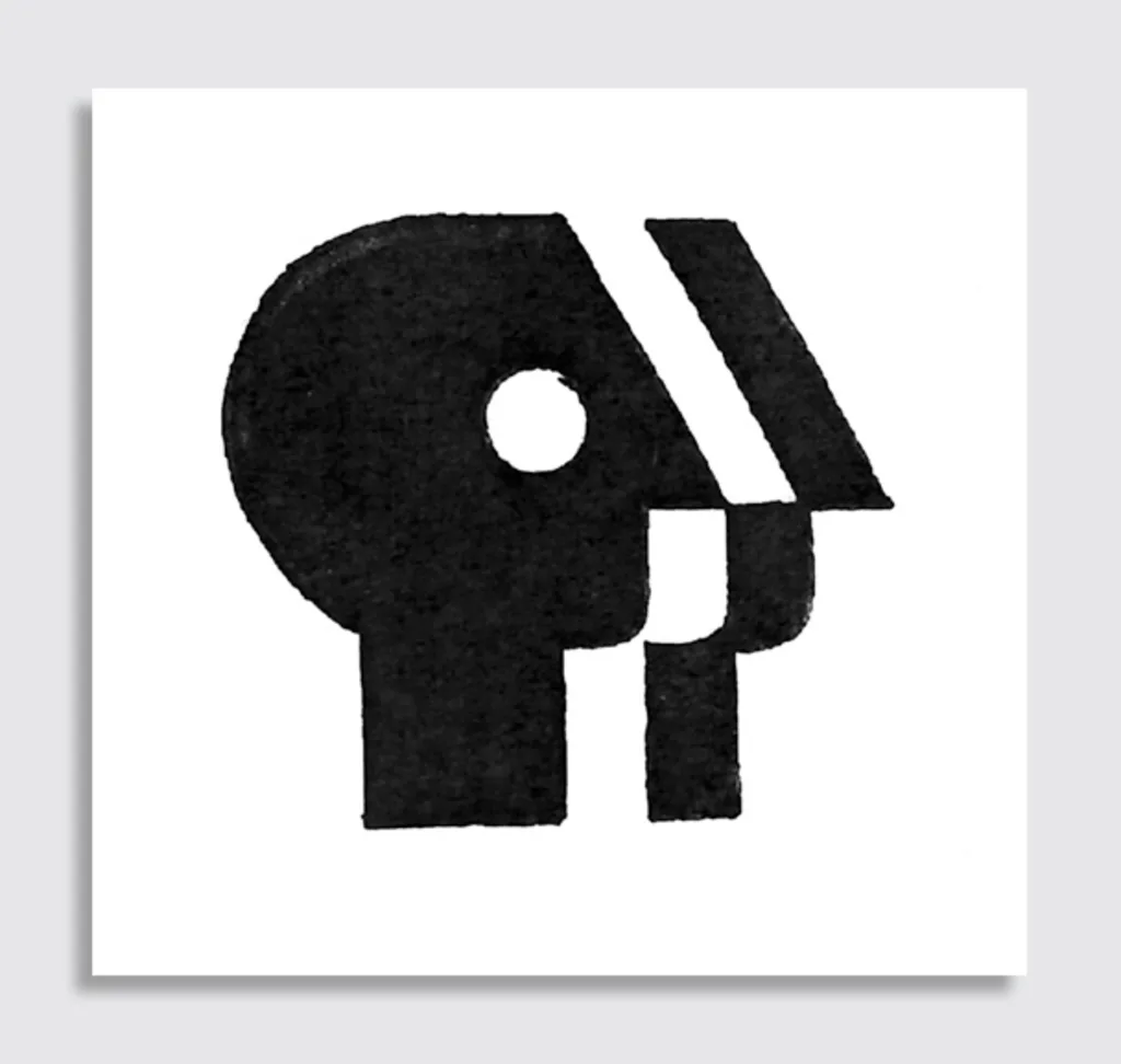
The logo has a name: the “Everyman,” first coined by the iconic corporate designer Herb Lubalin, who designed the original PBS mark in 1971 to unify the look of its 200 local stations. “The obvious illusion comes out of the name,” Lubalin said. “Public means people.”
Republicans have long accused the broadcaster of liberal bias and have for decades attempted to curtail its funding, although this position runs counter to public opinion—66% of Americans agree that they support federal funding for public radio, and 7 in 10 think it’s a valuable service, according to a recent Harris national poll.
Finally, last month Republicans succeeded. Congress rescinded $1.1 billion in previously approved federal funding for public broadcasting as part of a $9 billion rescissions package suggested by President Trump, largely along party lines. This eliminates all federal funding for NPR and PBS, which had been approved through 2027 with bipartisan support by congress.
The Senate Appropriations Committee then declined to restore some of the funding for the next budget year, which supporters of PBS previously considered to be a possible path forward for the broadcaster. The Corporation for Public Broadcasting will now shut down, it announced last week.

More than 70% of CPB’s annual federal appropriation goes directly to more than 1,500 local public media stations, according to a web page of its financials. This loss in funding could force local stations, especially in rural areas, to shut down, according to the CPB. Local member stations are independent and locally owned and operated, according to NPR. As a public-private partnership, local PBS stations get about 15% of their revenue from federal funding.
Following this news, I got in touch with Geismar to see what he made of this turn of events. In this as-told-to, Geismar reflects on his 1984 design, and what it means in the context of PBS’s recent loss in funding and the new challenges it faces today. The Corporation for Public Broadcasting did not reply to a request for comment by time of publication.
“There is an ironic tie-in between the government decision to cut off all funding to public television and public radio, and what prompted the redesign of the PBS logo back in the early 1980s.
That was also a difficult time, financially, for the Public Broadcasting Service, and especially the stations in more remote regions of the country. Much of the public equated PBS with the major television networks CBS, NBC and ABC, and presumed that, like those major institutions, PBS was the parent of and significant funder for all the local public television stations throughout the country. But, in fact, the reality is somewhat the opposite. Although PBS local affiliates received a portion of funding from the federal government, it is the individual stations that have the responsibility to do public fund raising, and PBS, in a sense, works for them.

Because of this confusion, the PBS leadership felt that their existing logo (a famous design by by Herb Lubalin) needed to be more than just the classic 3-initials mark, something more evocative of a public-benefit system serving all people. Thus the “everyone” mark was born.

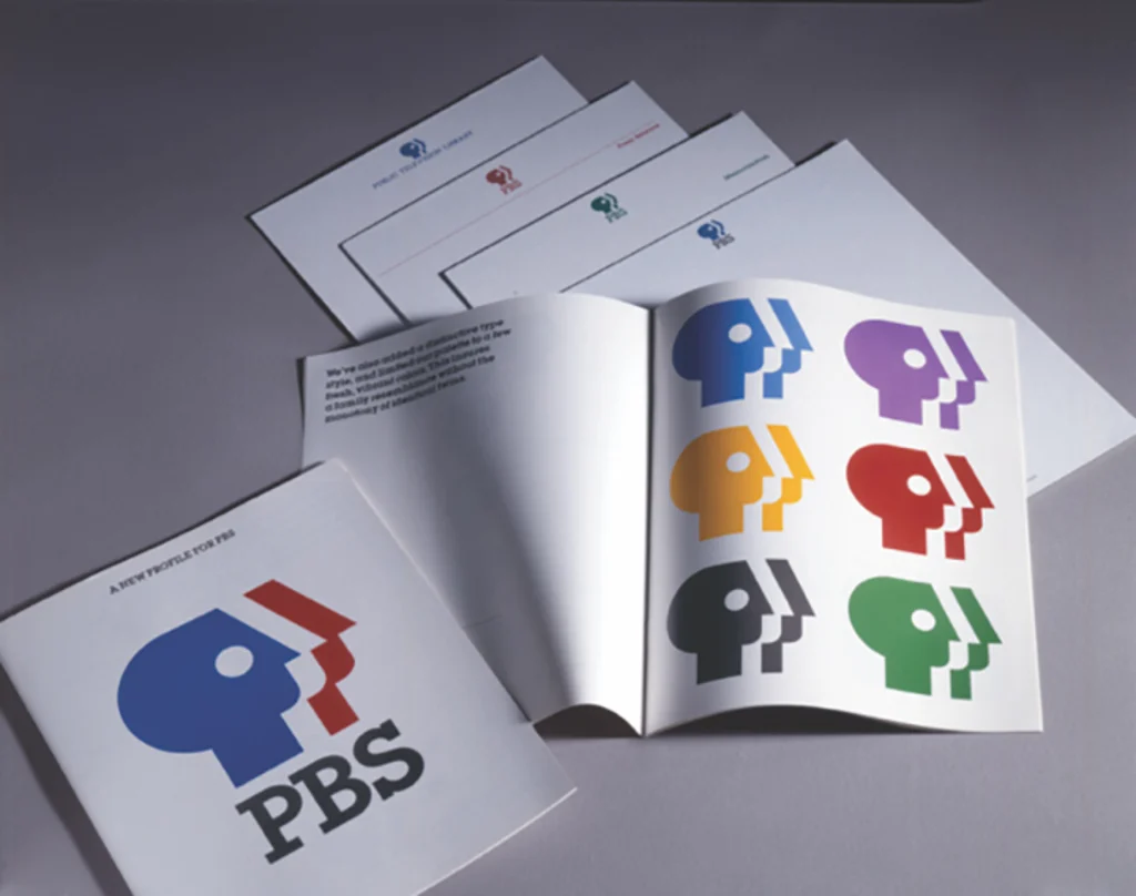
To preserve some continuity, we took the P from the prior PBS mark, which had been rendered as a human face in profile, flipped it around to be clearly just a human profile, and gave it a facelift and a gentle lobotomy. We then repeated the profile in both positive and negative form, to suggest a multitude, a public, and combined this mark with the initials PBS in a bold type style to form the new, more appropriate PBS visual identity. Though in subsequent decades the profiles have been subtly modified, this “everyone” concept has been the core of the PBS visual identity ever since.

And now, once again, with federal government funding stopped, it is the stations in the less populous regions who will suffer the most.”

